ShopDreamUp AI ArtDreamUp
Deviation Actions


![SUNNY SIDE UP! [Kuro-E artbook: Challenge ]](https://images-wixmp-ed30a86b8c4ca887773594c2.wixmp.com/f/57be0b6c-4807-4ecc-9d10-1cf115623251/d6yo0xu-e70d236d-bc6d-4e2e-856a-983b1f865b45.jpg/v1/crop/w_92,h_92,x_0,y_9,scl_0.14330218068536,q_70,strp/sunny_side_up___kuro_e_artbook__challenge___by_saracuervo_d6yo0xu-92s.jpg?token=eyJ0eXAiOiJKV1QiLCJhbGciOiJIUzI1NiJ9.eyJzdWIiOiJ1cm46YXBwOjdlMGQxODg5ODIyNjQzNzNhNWYwZDQxNWVhMGQyNmUwIiwiaXNzIjoidXJuOmFwcDo3ZTBkMTg4OTgyMjY0MzczYTVmMGQ0MTVlYTBkMjZlMCIsIm9iaiI6W1t7ImhlaWdodCI6Ijw9OTAwIiwicGF0aCI6IlwvZlwvNTdiZTBiNmMtNDgwNy00ZWNjLTlkMTAtMWNmMTE1NjIzMjUxXC9kNnlvMHh1LWU3MGQyMzZkLWJjNmQtNGUyZS04NTZhLTk4M2IxZjg2NWI0NS5qcGciLCJ3aWR0aCI6Ijw9NjQyIn1dXSwiYXVkIjpbInVybjpzZXJ2aWNlOmltYWdlLm9wZXJhdGlvbnMiXX0.49hjUAVTpWiKLjgmjzqL-bkZBmPbsB2YdJqJ7g-62UI)


![I love you! [+speedpaint]](https://images-wixmp-ed30a86b8c4ca887773594c2.wixmp.com/f/8debd67d-e4d9-453b-aed3-998549f50bbd/dau30zr-95de6d6f-679a-4b04-889b-71d0d2a93a3a.png/v1/crop/w_184,h_184,x_19,y_0,scl_0.059012187299551,q_70,strp/i_love_you____speedpaint__by_martith_dau30zr-92s-2x.jpg?token=eyJ0eXAiOiJKV1QiLCJhbGciOiJIUzI1NiJ9.eyJzdWIiOiJ1cm46YXBwOjdlMGQxODg5ODIyNjQzNzNhNWYwZDQxNWVhMGQyNmUwIiwiaXNzIjoidXJuOmFwcDo3ZTBkMTg4OTgyMjY0MzczYTVmMGQ0MTVlYTBkMjZlMCIsIm9iaiI6W1t7ImhlaWdodCI6Ijw9OTAzIiwicGF0aCI6IlwvZlwvOGRlYmQ2N2QtZTRkOS00NTNiLWFlZDMtOTk4NTQ5ZjUwYmJkXC9kYXUzMHpyLTk1ZGU2ZDZmLTY3OWEtNGIwNC04ODliLTcxZDBkMmE5M2EzYS5wbmciLCJ3aWR0aCI6Ijw9MTI4MCJ9XV0sImF1ZCI6WyJ1cm46c2VydmljZTppbWFnZS5vcGVyYXRpb25zIl19.tSgbJbjD030wbHyfK4FWhJvr3PbYH9aGYWSAXerPdhA)
![I love you! [+speedpaint]](https://images-wixmp-ed30a86b8c4ca887773594c2.wixmp.com/f/8debd67d-e4d9-453b-aed3-998549f50bbd/dau30zr-95de6d6f-679a-4b04-889b-71d0d2a93a3a.png/v1/crop/w_92,h_92,x_10,y_0,scl_0.029506093649775,q_70,strp/i_love_you____speedpaint__by_martith_dau30zr-92s.jpg?token=eyJ0eXAiOiJKV1QiLCJhbGciOiJIUzI1NiJ9.eyJzdWIiOiJ1cm46YXBwOjdlMGQxODg5ODIyNjQzNzNhNWYwZDQxNWVhMGQyNmUwIiwiaXNzIjoidXJuOmFwcDo3ZTBkMTg4OTgyMjY0MzczYTVmMGQ0MTVlYTBkMjZlMCIsIm9iaiI6W1t7ImhlaWdodCI6Ijw9OTAzIiwicGF0aCI6IlwvZlwvOGRlYmQ2N2QtZTRkOS00NTNiLWFlZDMtOTk4NTQ5ZjUwYmJkXC9kYXUzMHpyLTk1ZGU2ZDZmLTY3OWEtNGIwNC04ODliLTcxZDBkMmE5M2EzYS5wbmciLCJ3aWR0aCI6Ijw9MTI4MCJ9XV0sImF1ZCI6WyJ1cm46c2VydmljZTppbWFnZS5vcGVyYXRpb25zIl19.tSgbJbjD030wbHyfK4FWhJvr3PbYH9aGYWSAXerPdhA)


Description
website | tumblr | twitter | instagram | behance | artstation | online shop | Society6 | INPRNT | commissions
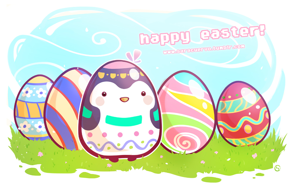
It's been a while since I last painted some cute penguins~ I really missed it. Also, I tried to manage my way through illustrator... but man, vectors are hardand I'm a total noob at it.
The pic came out nicely, though! And let me say, it looks pretty awesome as a pillow or a laptop skin. There's free shipping on Society6 until April 12, so if you want to get something, this is your chance") Click through this link to get the promo.
Click through this link to get the promo.
Happy Easter, everyone! Let's enjoy this upcoming spring together
★ [TUMBLR POST] ★ [SOCIETY6 SHOP]
It's been a while since I last painted some cute penguins~ I really missed it. Also, I tried to manage my way through illustrator... but man, vectors are hard
The pic came out nicely, though! And let me say, it looks pretty awesome as a pillow or a laptop skin. There's free shipping on Society6 until April 12, so if you want to get something, this is your chance
Happy Easter, everyone! Let's enjoy this upcoming spring together
★ [TUMBLR POST] ★ [SOCIETY6 SHOP]
Thanks for watching, hope you'll like it! 


![SUNNY SIDE UP! [Kuro-E artbook: Challenge ] by SaraCuervo](https://th08.deviantart.net/fs70/150/f/2014/015/4/9/491d750f49e0a923dc8cfdbd6d061e3c-d6yo0xu.jpg)
Image size
1000x652px 396.57 KB
© 2015 - 2024 SaraCuervo
Comments1
Join the community to add your comment. Already a deviant? Log In
Let me start by saying that this is absolutely gorgeous. The colour palette is beautiful and I love that you used a colour that's just a titch more saturated for the line on the penguin's midriff to make him stand out more. There are however a few things that i would change.
~ The purple lines on top of the penguins head, I am not sure if they are surprise lines or if they are supposed to be some sort of top hat
~ On the egg to the right of the penguin the fact that there is only a bit of blue at the top in stead of throughout that egg's pattern makes it look like you forgot to colour it in rather than having it look like an intentional decision
~ The Happy Easter text going against the flow of the wind really takes me out of the piece. That is the biggest issue I have it feels like it doesn't really belong and actually kind of clashes. I also think it might benefit from a capitalisation of the "h" and the "e"
Overall a fantastic piece, keep up the good work!